

Top 7 common mistakes with fine art printing rarely happen at the machine. They happen in the file, weeks earlier, and our studio has watched the same ones resurface across wall prints, portfolio sheets, and signed exhibition editions. Bad color, mismatched paper, a missing bleed edge — none of that is a press failure. It is a preparation failure, and every item on this list is preventable long before we load paper.
The seven we will walk through are the ones we see most often on small and mid-sized fine art work. Each gets a full treatment: why it happens, how we catch it, and what we ask clients to change. Read it once end to end. If you are moving from screen design into physical print, come back to each section while you prep a real file. That habit alone saves at least one reprint.
Mistake #1 — Designing the file in RGB instead of CMYK
This one bites designers who grew up on screens, and it bites hard. In RGB, red, green, and blue light mix additively. A press does the opposite. Cyan, magenta, yellow, and black ink sit on paper and absorb light rather than emit it. Because the two systems run in opposite directions, the CMYK gamut lives well inside what your monitor can display.
Some colors simply cannot be reproduced in ink, no matter how precise the press is. Saturated blues, neon corals, and hot magentas get compressed. On paper they slide toward gray, violet, or a muddy brown. A sunset packed with orange and red can collapse into one flat mass. We have returned proofs where a client’s signature gradient lost half its depth, because that depth only existed in light.
The subtlety most people miss is this. Converting a file to CMYK does not automatically fix anything if you convert with a generic profile. And even a clean conversion cannot rescue colors outside ink’s physical range. The only honest test is a real proof, not a guess on a backlit screen.
What we advise before designing a color-heavy set: soft-proof inside your software first. Toggle the CMYK preview before you commit to a palette. If a blue goes dead or a pink turns dusty, adjust the original RGB file rather than patching the converted CMYK version. Working backward tends to shred the gamut further. Our deeper write-up on color theory for print designers walks through the screen-to-paper translation properly if you want the long version.
Mistake #2 — Choosing paper on instinct instead of display intent
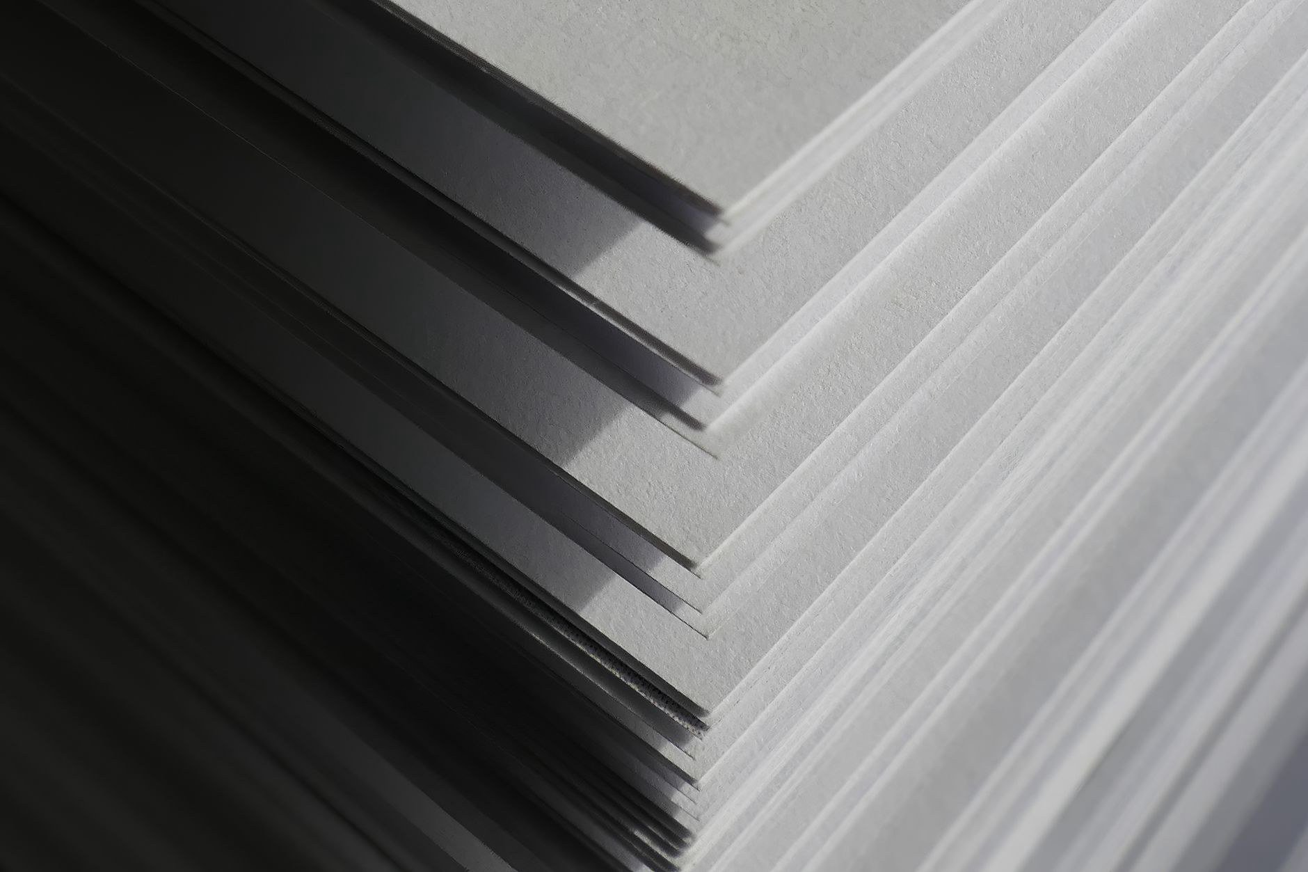
The second recurring error is paper selection, and it shows up most in wall prints, portfolios, and small exhibition photos. Three variables have to line up at once: whiteness, weight, and surface. Get any one wrong and the whole piece feels off, even when the color is perfect.
Whiteness is scored on a CIE scale, and higher numbers mean brighter sheets. Paper that is too bright pushes images cool. Skin tones turn faintly blue. Autumn landscapes lose their warmth. Weight, measured in gsm, is the mass of one square meter of the sheet. Fine art papers usually sit between 200 and 310 gsm. Anything under 200 feels flimsy and buckles when heavy ink lands. Overly thick stock refuses to feed through some machines, and then you are paying for backing reinforcement after the fact.
Surface decides how the print feels in the hand. Matte cuts glare when a piece hangs opposite a window, though it holds blacks less deeply than gloss. Satin splits the difference and suits architecture and product shots. Rag, cotton-based rather than wood pulp, drinks ink heavily. It feels wonderful to touch but tends to print slightly flatter than the proof suggests.
We ask clients to decide based on where the piece will live. A living room with warm bulbs and a window opposite? Lean matte or satin. A dark hallway lit by a couple of spots? Bright, lightly glossy stock helps the image glow where the light beams land. A gallery with even diffused light rewards rag or subtle texture, which reads as more refined in person. There is also a quiet cost to guessing: a wrong swatch means a second run, and that second run rarely looks like the first.
The detail everyone overlooks is that cotton rag shifts color. The sheet absorbs so much ink that the printed result looks duller than the soft-proof. A press can compensate through its profile, but the client has to accept some movement. Nothing beats holding a real swatch under the lighting where the piece will actually hang. If you want the long version, our guide to paper selection for fine art printing covers it in depth.
Mistake #3 — Ignoring ICC profiles and skipping the proofing stage
Small studios and independent photographers who print their own runs hit this one constantly. An ICC profile, in plain language, is a file that describes how a specific press-and-paper combination renders color. Every pairing has its own profile. They are not interchangeable.
The rule is straightforward. Use the profile built for the exact printer and the exact paper you are running. A generic coated stock profile delivers acceptable results for a newsletter. It will not deliver fine art. Most serious fine art shops keep dedicated profiles for each paper line they carry, and we always suggest asking directly instead of assuming. If a shop cannot produce a profile for a given paper, treat that as information. It usually means their workflow is built around general commercial work rather than precision art reproduction.
Proofing follows the same logic. Soft-proofing displays a simulation on screen. Hard-proofing prints a physical sheet, ideally on the same paper the final run will use. Hard proofs cost more, but for a commission that matters, the expense is trivial compared to a reprint.
One detail people gloss over: if the monitor is not calibrated, all color matching collapses. A slight blue drift pushes every correction in the wrong direction, and you keep chasing a phantom. A calibrator costs little and pays for itself in one or two jobs. If you both design and print, put one on the desk before you commit to any color-critical run. This ties directly into how ink behaves on a press, and our piece on how offset printing works goes into the color-control stage in more detail.
Mistake #4 — Resolution that does not match the final output size
This mistake clusters around people scaling up phone shots or downloaded images. The technical anchor here is ppi, or pixels per inch as rendered on paper. For fine art viewed up close — wall pieces, portfolios, hand-held prints — 300 ppi at the actual print size is the safe bar.
Here is a concrete example. A file at 3000 x 4200 pixels prints roughly 25 x 35 cm at 300 ppi with crisp detail. Run the same file at A2 and the ppi drops by half. Up close you will see stair-stepping or mush. Modern phone cameras capture plenty of pixels, but JPEG compression eats detail in shadow and gradient areas — exactly where large prints reveal weakness.
AI upscaling is a double-edged tool. It can invent detail that looks convincing on screen but comes from the algorithm’s guesswork, not the original capture. Close inspection shows odd smooth skin, hair matted into blocks, foliage reduced to meaningless shapes. Clients buying large wall pieces will spot it. The reliable test is a physical proof at final size, or at least a crop of it.
When no high-resolution source exists, two practical options beat AI upscaling: print smaller, or accept a distant viewing distance. From 1.5 to 2 meters away, 150 ppi holds up fine for many subjects. Being honest about how far the viewer will actually stand makes the decision far easier. We have walked a few clients through exactly this conversation, and most of them end up happier with a smaller, sharper piece than a big soft one.
Mistake #5 — Crooked margins, missing bleed, and the signature that gets cut off
The next mistake surfaces on editions with even white borders, signatures, or numbered prints. Three concepts matter before a file leaves your hands, and we have seen each one fail at the trimmer.
- Bleed is the image or color extending past the intended trim, usually 3 mm per side, so no white sliver appears after cutting.
- Safe zone is the distance from anything important — signature, edition number, border — to the trim line, and 3 to 5 mm is a practical minimum.
- Cut tolerance is the acceptable drift of the trimming machine. Manual guillotines move 1 to 2 mm. Semi-automatic cutters drift less, but they still drift.
The common failure is forgetting bleed, which leaves uneven white borders after trimming. Collectors notice immediately and are not amused. Worse is a signature placed too close to the edge, where the blade slices through part of it and the edition loses its mark.
Our rule of thumb: keep the signature at least 8 to 10 mm from the trim. For bordered prints, allow 3 mm of bleed plus 5 mm of safe area, and the white border will read evenly even if the cutter shifts slightly. Every shop runs a different tolerance, so ask for the number instead of assuming everyone trims identically. On one run years ago, a client’s numbered edition came back with the edition number clipped by less than a millimeter — invisible in the file, obvious on the sheet, and impossible to unsee once you know.
Mistake #6 — Wrong expectations about fade resistance and storage
People printing to sell, or hanging work near windows and humid rooms, run into this one. Start with the distinction between pigment and dye inks. Pigment inks suspend solid color particles in a carrier, and those particles sit on the paper surface. Dye inks dissolve completely into a liquid, soak into the fibers, and fade faster under UV.
Pigment lasts longer, no question. But durability also depends on paper, framing, light exposure, and humidity where the piece hangs. We keep reminding clients not to take “100-year” ratings on packaging as gospel. Those numbers come from tightly controlled lab conditions, not from a living room with a west-facing window. Direct sunlight, tropical humidity, diesel fumes from a nearby street — all of it shortens the real lifespan of a print. The only honest measurement comes from following an actual framed piece over time and recording what happens.
Three low-cost habits extend the life of any print: use UV-filtering glass when the frame is sealed, insert a spacer between the print surface and the glazing to prevent contact, and hang away from the hottest point of direct sun. On high-value work, replacing the UV glass at the end of its service life is worth doing. Our notes on luxury print finishing techniques touch on the same concerns when a piece carries a serious price tag, and the same collision between decorative choices and physical reality shows up in everything from book cover design principles to full production runs.
Mistake #7 — Sending the file without an internal check
First-time clients without an internal checklist run into this repeatedly. It is very human. Someone sends the file and only afterward remembers the fonts were never outlined, or realizes an image was placed as a link rather than embedded. The shop opens the file, reports errors, and half a day vanishes in emails back and forth.
A short pre-flight pass catches most of it. Confirm the color space is CMYK with the correct profile. Check ppi at final size. Verify bleed meets the shop’s requirement. Outline the fonts or flatten them properly. Confirm the document dimensions match the ordered size, and that units are in millimeters rather than inches. That is five minutes of work that saves a great deal of stress.
A checklist is not a proof, though. It catches structural problems, not how the image will read on paper. For anything that matters — high budget, sale-ready editions, client work where perfection is the deliverable — proof before the full run. The cost of one proof sheet is far smaller than a full reprint. What these two habits share is a willingness to slow down at the front end so the back end stays calm. Across every discipline we work in, that principle holds. If you ever branch into physical products like the practitioners writing about turning passion into profit, you will find the same logic applies.
When to sit down at the press instead of working online
This matters for small-run fine art jobs where color is the entire point — portfolios, exhibition prints, limited sales editions. The decision rule is fairly clear. If color is the selling feature, seeing the proof and the paper swatch in person costs less than getting it wrong. Sitting beside the press operator, watching the first proof come off, pointing at a swatch in your hand and saying “that one” — that two-hour session routinely saves two weeks of file ping-pong by email.
The trade-off is travel time. On a high-value job, that cost is small next to the risk of a reprint. Our own experience says exhibition prints and one-off portfolios almost always belong in the in-person category. Repeat runs with an approved sample can move entirely online.
A case from our own work: a client preparing a solo show spent three weeks emailing files back and forth without locking the color. Eventually they brought a stack of paper samples and sat with our press operator for an afternoon. In that single session we found the root cause — the design used a vivid blue that simply cannot be reproduced in standard CMYK. The client chose a softer blue, and the entire set printed in two days. Three weeks of email compressed into one afternoon. For anyone selling artwork directly to collectors, this connects closely to the idea behind selling direct to buyers without a marketplace, where print quality is not negotiable.
Real questions clients ask us before a run
Does fine art printing require pigment inks?
Not strictly, but anyone selling to collectors should use pigment. Pigment resists light and humidity far better. Dye is cheaper and delivers punchier color straight off the press, yet it fades much faster over time. If the print is going up for sale or hanging long term, pigment is the answer. For quick tests or short-lived displays, dye is acceptable.
What paper works best for an indoor wall print?
Opposite a window, lean matte or satin to prevent glare. A sheet around 250 to 310 gsm will hold flat without buckling. In a room with warm bulbs, avoid paper that is too bright, since it can push the image cool. Cotton rag feels most luxurious, but expect the printed color to sit slightly below the proof. The safest path is always holding real swatches under the room’s actual lighting before deciding.
Can converting RGB to CMYK save a neon color?
No. Neon and vivid blues fall outside the CMYK gamut. After conversion they dull, gray out, or shift violet. A shop can nudge things with a profile, but the physical limit of ink does not move. The only workable fix is redesigning toward a tone that fits inside CMYK, or accepting a significant difference from the screen.
Should I always pay for a proof before the full run?
On anything important — sold work, exhibitions, portfolio pieces — yes. A single small proof costs a fraction of a full reprint when color goes sideways. Repeat orders with an approved sample can run without a fresh proof. The simple test: if you feel nervous about color, get a proof. That instinct is almost always correct.
How do I know whether a shop has proper color profiles?
Ask whether they keep a dedicated profile for each press-and-paper pairing. Specialist fine art shops usually do, and they can hand over the file for your design application. If the answer is vague, or they use one profile across every paper, that signals a general-print workflow rather than art-focused work. Ask about hard and soft proofing as well. Both available is a good sign. Only one, or neither, is worth a second thought before committing. If you are new to the category entirely, our broader guides under traditional printing cover the foundations.
What ties all seven mistakes together
Every one of these errors shares a root. They come from decisions made before the press ever runs — on a screen, in an email, in a hurried swatch choice, or in a silent assumption about what the shop will handle. Fine art printing rewards patience at the front end. That starts with color that respects ink rather than a backlit display. It continues with paper chosen for the space the work will live in, a calibration habit that keeps your eye honest, and a pre-flight routine that catches structural mistakes before they become expensive.
What we have learned after years at the press is that good outcomes rarely come from heroic fixes late in the process. They come from slowing down early, asking the shop the awkward questions, and being willing to sit in the studio when a job justifies it. Do that, and the seven mistakes on this list stop being warnings and start being habits you never picked up in the first place.