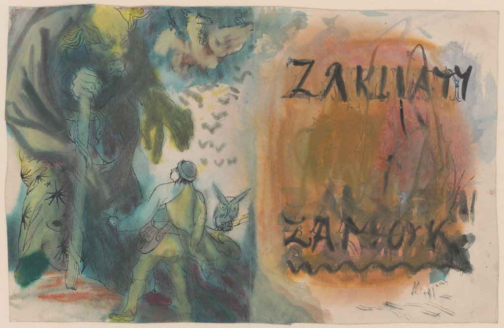
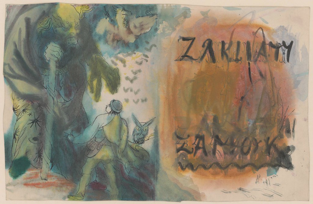
Book cover design begins with an editorial decision: what promise should the book make before it is opened? The cover is small, crowded with obligations, and expected to work at several distances. It must catch the eye on a table, remain legible on a shelf, and survive reduction to a thumbnail.
I ask designers to read enough of the manuscript to identify its pressure point rather than merely illustrate a scene. A cover for a novel about memory might use an object from the story, but the useful question is how that object changes through the narrative. That distinction separates a concept from decoration.
Book Cover Design Needs a Clear Brief

A practical brief states the trim size, binding, page extent, audience, format, schedule, budget, and sales context. It also identifies required copy: title, subtitle, author name, endorsements, imprint, price, ISBN, and barcode. Missing information becomes expensive when it arrives after artwork has been commissioned.
The brief should describe the manuscript in plain terms. Avoid directing the final image before the designer has explored the material. I prefer a page of themes, tensions, comparable titles, and production constraints to a request for a specific stock photograph with type placed above it.
Comparables are useful for mapping a market, but copying their surface cues produces a shelf of interchangeable books. Study what those covers communicate, then find a different route to the same reader expectation.
Reduce the Concept to One Strong Move
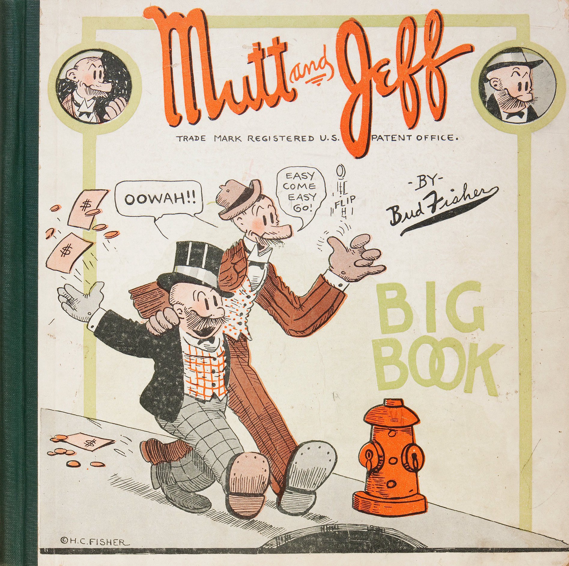
Many early comps fail because they contain too many ideas. A landscape, portrait, symbolic object, patterned frame, and large title all compete for the same limited space. Remove elements until the hierarchy becomes unmistakable.
One strong move does not mean one literal image. It can be an unusual crop, a typographic interruption, a color field, or a relationship between front and back. On a recent essay collection, the most successful direction replaced a collage of twelve themes with a single narrow horizon running around the entire jacket. The image became quieter, while the book gained presence.
Show concepts at actual size and as thumbnails. Large presentation boards flatter intricate details. A cover that only works at poster scale has not solved the publishing problem.
Typography Carries the Editorial Tone
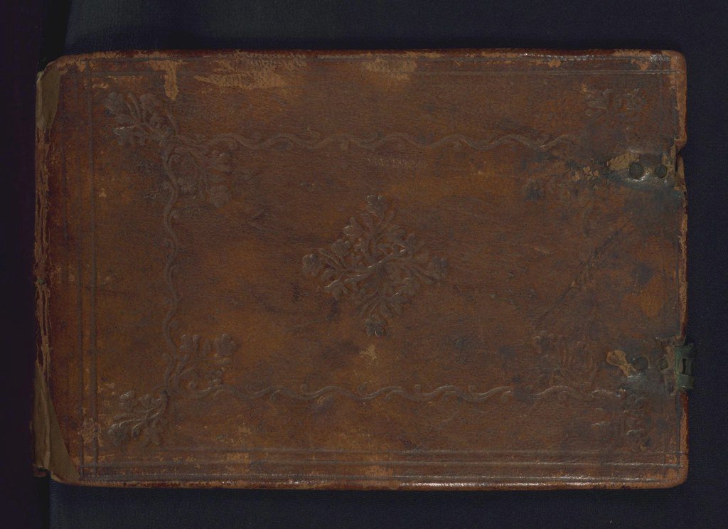
Titles need character and immediate recognition. Author names and subtitles need a defined supporting role. I usually begin with one family and add a second only when it solves a real problem.
Our five rules for pairing type provide a dependable framework. In practice, the manuscript’s tone matters more than a generic formula. A severe condensed sans might suit investigative nonfiction but make an intimate memoir feel remote.
Kerning should be judged in the final words, not trusted to default settings. Large title type exposes awkward pairs. Print the cover at 100 percent and view it from across the room. Then reduce it to the size shown in an online catalogue. Both tests reveal different weaknesses.
When a retail font cannot carry the voice, custom lettering may be justified. The process in our feature on developing a typeface from sketches shows why distinctive letters require structural discipline, not merely decorative quirks.
Color Must Work in Ink
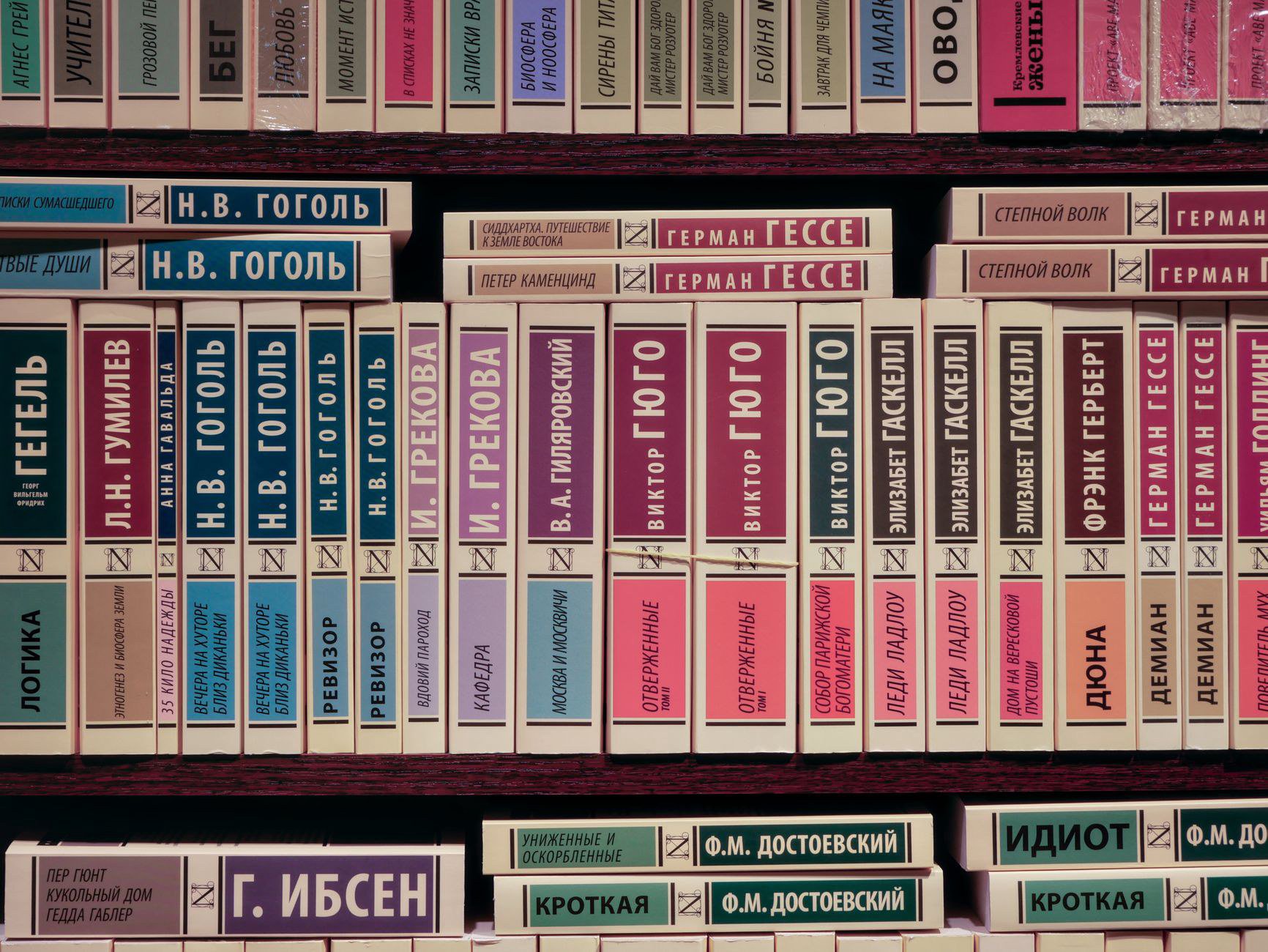
Color establishes genre quickly, but inherited genre palettes can become clichés. Dark blue and a single red accent may signal a thriller; that does not mean every thriller needs the same treatment. Look for color relationships already present in the setting, period, or emotional arc.
Screen color is only a proposal. Rich blues can shift purple in CMYK, delicate shadows may close on uncoated stock, and fluorescent intensity requires a spot ink. Our guide to color for print production explains why paper and ink must be considered together.
I ask for proofs under more than one light source. A warm gray that feels nuanced in daylight can become brown under retail lighting. When color matching is critical, a drawdown or press proof is more informative than repeated monitor adjustments.
Design the Whole Object
The front cover receives attention, but the spine is what many readers see first. Its width depends on final page count, paper bulk, and binding method. Do not finalize a spine from an early manuscript estimate.
Set the spine title with enough clearance from both folds. Very narrow spines may need a shorter title treatment or no type at all. On thicker books, check that the lettering still appears centered after the cover wraps around the bound text block.
The back cover must accommodate copy that often changes late. Build flexible zones for endorsements, description, author biography, imprint marks, and barcode. A barcode is part of the composition; dropping it into an arbitrary white box at the end can damage an otherwise careful layout.
Flaps and endpapers can extend the visual idea. They should not become a dumping ground for unused motifs. A quiet solid color inside a visually active jacket often gives the object welcome rhythm.
Choose Materials Early
Paper, board, cloth, lamination, and finishes alter both color and touch. An image printed on bright coated stock behaves differently on a toothy uncoated sheet. Soft-touch lamination deepens some colors but can mark easily. Metallic foil reflects rather than reproducing a flat digital swatch.
Techniques such as embossing and foil stamping should reinforce the concept. A blind emboss can make a nearly invisible title physically present. A small foil element can direct the eye. Covering every available detail in foil usually removes the hierarchy that made the finish appealing.
Packaging examples at Frost of London show how materials can shape perceived value. For books, however, durability and handling matter alongside luxury. A beautiful cloth that scuffs in distribution may be wrong for a large trade run.
Interviews and professional discussions collected by Design Interviews are also useful reminders that production choices emerge from collaboration. The printer or binder often knows which apparently small adjustment will make a finish cleaner and more reliable.
Commission Illustration with Production in Mind
A good illustration brief explains content, mood, dimensions, deadlines, and technical limits. It reserves space for the title without dictating every mark. Supply a template showing bleed, folds, spine, flaps, and safe areas before final art begins.
Agree on the stages of approval. Rough sketches should resolve concept and composition. Refined sketches establish detail. Final art should not be the first moment when the editor sees the direction. Clear stages protect both the illustrator’s time and the publisher’s schedule.
Specify whether artwork must wrap continuously, separate into color plates, or allow for a spot finish. An image that crosses a spine needs tolerance for binding variation. Fine detail placed on a crease may disappear.
Test the Cover Where Readers Will See It
Place the comp among competing titles at approximate shelf size. The goal is not always to be the loudest. It is to be recognizable and appropriate. A restrained poetry cover can stand apart in a category filled with saturated photography.
Thumbnail testing is equally direct. Reduce the front cover until it is about as wide as a mobile search result. The title, major shape, and contrast should remain intelligible. Small texture can vanish, but the central idea should not.
Do not forget accessibility. Fine low-contrast type may look refined on a calibrated display but fail readers in ordinary conditions. Contrast, size, and clear hierarchy support both sales and reading.
Proof the Mechanical Details
Before release, check bleed, trim, safe areas, overprint, image resolution, color spaces, black builds, and spot-color names. Confirm that the ISBN on the barcode matches the edition. Review the printer’s dieline rather than relying on an old template.
I print and assemble a paper dummy for every unfamiliar format. Folding a flat layout into a jacket immediately exposes reversed panels, crowded flaps, and awkward transitions. For casebound books, the dummy also helps the team understand joints, turn-ins, and board edges.
Request a production proof appropriate to the risk. A digitally printed proof may confirm content and position but cannot predict foil, embossing, or exact offset color. Label what each proof can and cannot approve.
Give Feedback That Improves the Work
Art direction is more useful when it describes the problem. Saying that a cover feels too comic for a restrained novel gives the designer room to solve tone. Asking to move every object by a specific amount turns the art director into an inefficient operator.
Collect feedback before sending it. Conflicting comments from author, editor, sales, and publisher lead to hybrid solutions with no clear point of view. The art director should identify which concerns affect audience, accuracy, or production and which are personal preference.
Strong book cover design comes from a sequence of concrete decisions: a clear promise, a focused image, readable typography, appropriate materials, and disciplined proofing. When those decisions support the manuscript, the cover earns attention without misrepresenting the book it protects.