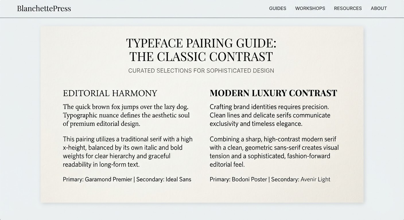
Font pairing is one of the trickiest — and most commonly botched — skills in print design. A mismatched typeface combination can undo an otherwise clean layout. Here are five golden rules that experienced designers swear by.
1. The Contrast Rule
Two typefaces that look too similar create visual friction — readers sense something is “off” without knowing why. Aim for clear contrast: a bold serif for headlines paired with a light sans-serif for body copy. The sharper the distinction, the easier it is for readers to tell each type’s role apart.
2. The Hierarchy Rule
Font pairing isn’t just about picking two attractive typefaces — it’s about establishing a reading order. Headlines, subheads, and body copy need distinct weight and size so the eye instinctively knows where to start.
3. Match the Mood
A classic 18th-century book serif will clash with a minimal geometric sans in the Bauhaus tradition. Before picking a pairing, define the piece’s dominant mood: elegant, minimal, nostalgic, or contemporary.
4. Classic, Reliable Pairings
- Playfair Display + Source Serif — elegant and editorial, ideal for magazines and art books.
- Helvetica + Georgia — modern and trustworthy, well suited to corporate collateral.
- Futura + Garamond — geometric meets classical, a favorite for premium fashion branding.
5. Proof at Real Size
A pairing that looks great on screen won’t necessarily hold up on an A5 flyer or a business card. Always proof at actual size and on the real paper stock before final approval — kerning that reads fine on screen often needs re-tuning once it hits paper.