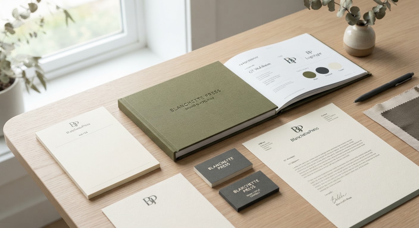
When your client is literally a handmade paper mill, the pressure on the design team multiplies: the identity has to demonstrate a deeper understanding of material than anyone else in the room. The Paper Mill project delivered exactly that.
The Brief
The Paper Mill is a small-batch papermaker producing sheets from cotton fiber and reclaimed textiles. The challenge: build an identity that doesn’t just talk about material — it has to be material.
The Design Solution
- A minimal wordmark logo — deliberately restrained so it never competes visually with the paper’s natural texture, which does the real talking.
- An earthy palette (olive, charcoal, cream) pulled directly from the raw, unbleached cotton fiber itself.
- Stationery printed on the mill’s own paper — turning the product itself into the most convincing marketing material available.
The Detail That Made It Work
The smartest touch was the business card: because of the handmade process, no two cards had quite the same grain. Rather than treating this as a flaw to fix, the team leaned into it as the core message — “no two cards are alike, just like no two clients are.”
Takeaway
A strong identity system doesn’t need a wide palette or elaborate detail. Sometimes, letting the material itself — something a client can physically touch — tell the story beats any tagline.