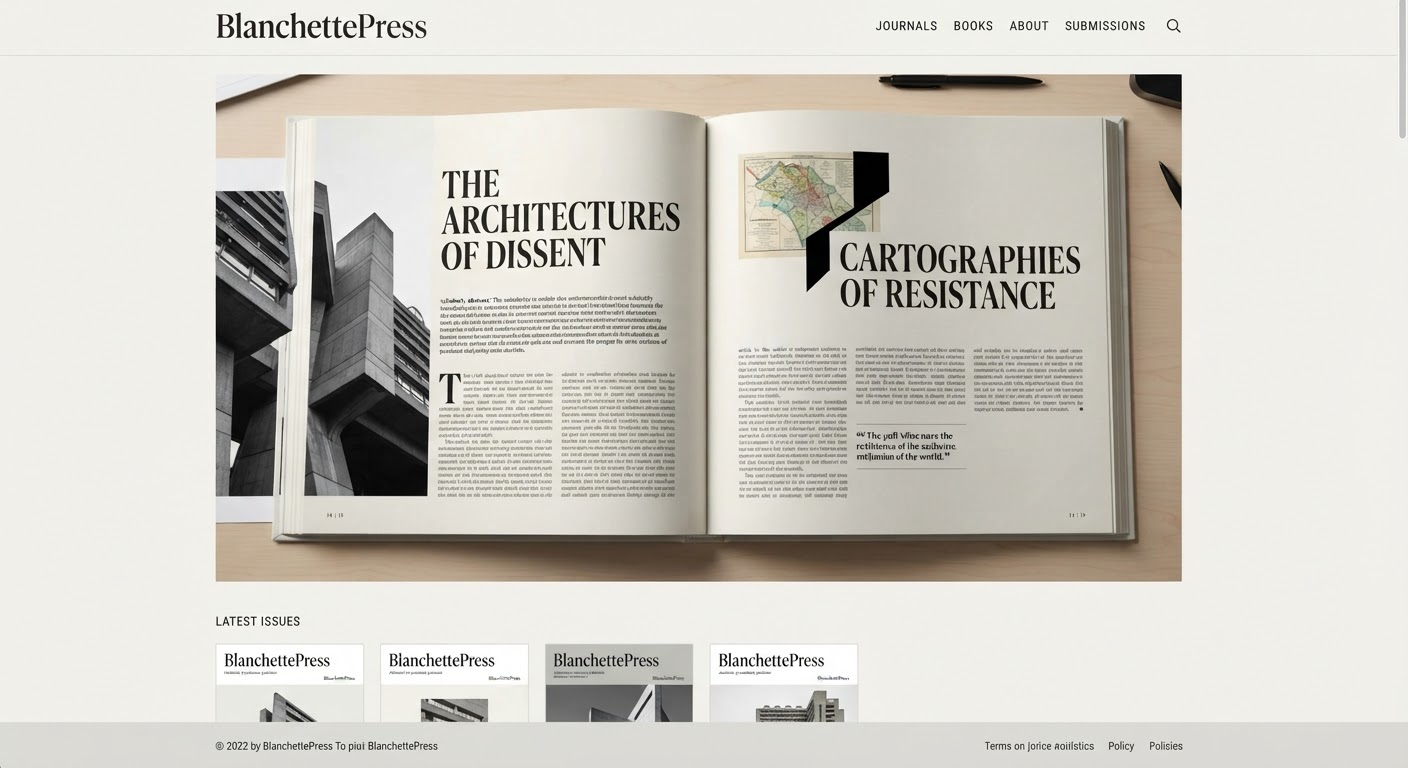
Behind the seemingly “free-form” creativity of every well-designed independent magazine sits a strict grid, quietly guiding the layout. A grid doesn’t limit creativity — it gives creativity structure.
What Is a Grid, and Why Does It Matter?
A grid is an invisible system of columns and rows that divides a page into consistent modules, helping align text, images, and white space uniformly across an entire publication — even when individual pages look quite different from one another.
Common Grid Types in Magazines
- Column grid: two to four columns, well suited to long-form text.
- Modular grid: divides the page into evenly sized squares, flexible for image-heavy spreads with captions.
- Asymmetric grid: deliberately breaks balance to create a visual focal point for a special feature story.
Establishing Visual Hierarchy
In editorial layout, the reading order needs to be unambiguous: headline → deck (intro) → body copy → image caption. Use clear differences in size and weight between each level so readers never lose their place.
White Space — an Underrated Tool
Many new designers try to fill every gap. But in high-end editorial layout, white space is a sign of confidence — it gives content room to breathe and signals a premium, unhurried feel.
Advice for Indie Publishers
You don’t need a complex grid for issue one. Pick a simple system, apply it consistently, then break it deliberately on one or two spreads per issue — consistency is what builds recognition for a recurring publication over time.