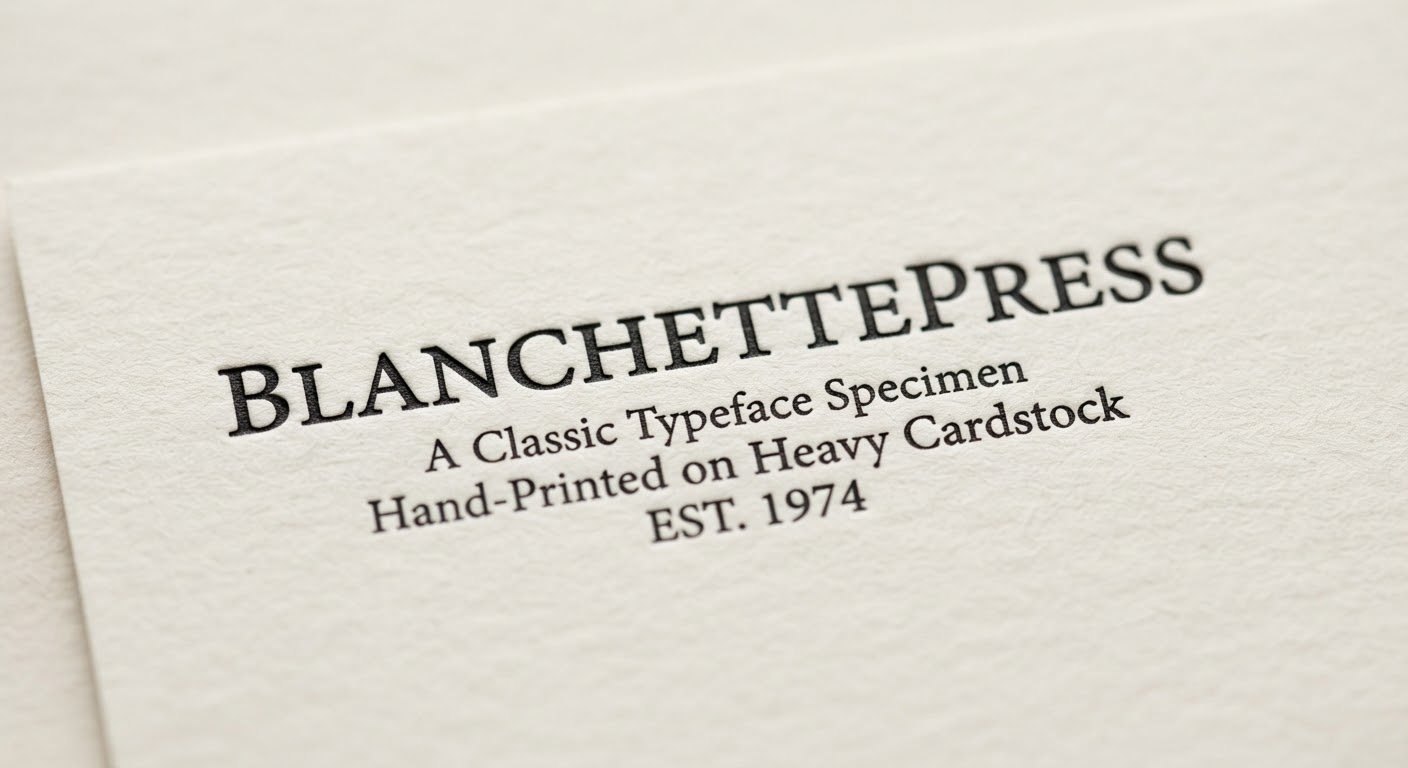
Typography moves in cycles — what feels dated often returns with a fresh coat of intent. Here are the typography trends worth watching in print design this year.
1. Editorial Serifs Are Back
High-contrast serifs like Playfair Display and Canela dominate magazine covers and art books right now, delivering a sense of cultural weight that stands in contrast to the minimal sans-serif wave of the previous decade.
2. Swiss Modernism, Revived
Strict grids, geometric sans-serifs, and generous white space — the Swiss style of the 1950s and 60s is being reclaimed by premium branding studios, especially for catalogues and annual reports.
3. Variable Fonts for Print
A variable font — a single file containing multiple weight and width variants — isn’t just a web convenience. It also lets print teams fine-tune fit across formats without juggling dozens of separate font files.
4. Handcraft Meets Digital
- Hand-lettering is digitized and layered alongside systematic sans-serifs as an accent.
- Riso printing effects — originally an analog process — are being simulated digitally to add intentional imperfection.
Takeaway for Designers
Trends shift, but the fundamentals — contrast, hierarchy, legibility — never do. Treat trends as seasoning, not foundation, for every typography project you take on.