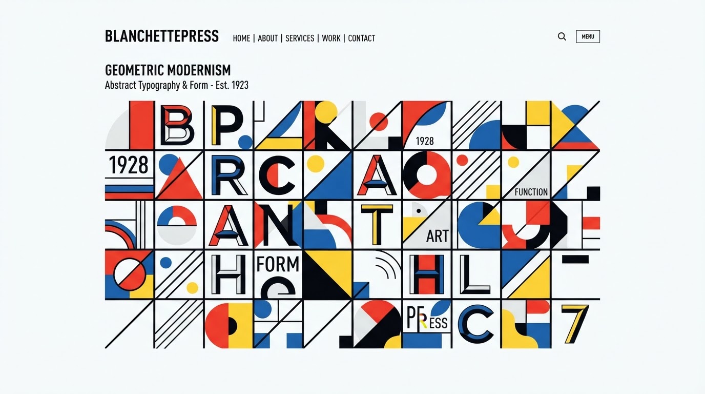
Designing a complete typeface is far more than drawing a handful of attractive letters — it’s a systems-thinking exercise that can take years to finish properly.
Step 1 — Establish the Skeleton
Every typeface starts with a handful of key letters: n, o, H, O, a. These characters set the proportions, curvature, and stress axis for the entire family. Get the skeleton wrong, and everything downstream inherits the error.
Step 2 — Draw Every Glyph
A basic Latin font needs at minimum 200–300 glyphs — uppercase, lowercase, numerals, punctuation, and accented characters. Markets requiring diacritics push that count significantly higher.
Step 3 — Kerning & Spacing
Kerning is the fine adjustment of space between specific letter pairs (like “AV” or “To”) to avoid awkward gaps. It’s the most time-consuming stage, and it’s what separates a font that feels “professional” from one that doesn’t.
Step 4 — Test in Context
- Test at small sizes (captions, footnotes) to verify legibility.
- Test at large display sizes to check whether geometric details break down when scaled up.
- Test on real paper — ink can add 5–10% visual weight compared to a screen render.
Step 5 — Package as OpenType
The final stage compiles the typeface into .otf/.ttf files, complete with OpenType features like ligatures, small caps, and oldstyle figures — the small refinements that separate a “good enough” font from a studio-grade one.